
Simple is never easy
A look at Alec Tear's creative portfolio design.
In a world of “home — about — work” websites, Smells Like Copy looks for the non-linear. This blog is a series of curated and deconstructed website narratives that break the mold. It’s interested in the cogs and wheels, experiential bits that are woven in to make something stand out. This season I’m putting my butcher’s on creative portfolios. Every issue is free — enjoy.
Wowowow.
The first “word” that came to mind after clicking through to Mr. Tear’s site. After having scrolled through a few hundred creative portfolios, arriving here felt like refreshing with a sip of cool water.
Both designer and letter artist, Alec’s gifts are appreciated by many. 44k font-philiacs on his IG are taking notes on his work. For the last 5 years, he’s been moving solo, teaming up with friends and favorite brands (in Alec’s case this looks like ‘lowkey design gigs’ with Stella Artois and Manchester United) to bring a certain clarity to their lines. In some of his design cases, it feels like confidently redrawing existing designs with his own hand is enough to make it do more. A kind of ‘Tear Touch’ if you will.
A nod to Noko
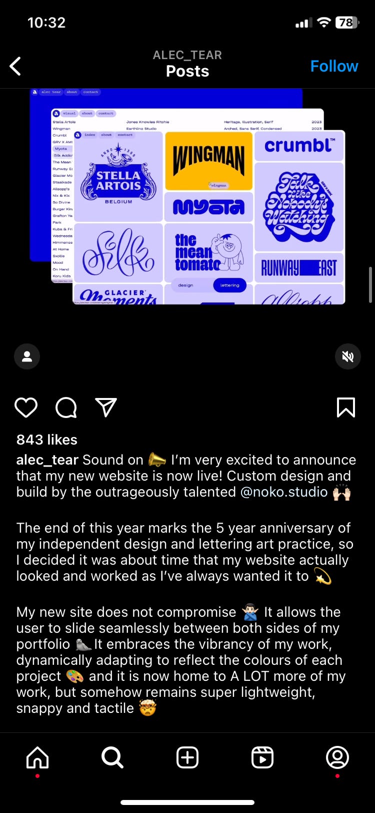
The web design studio behind this sleek information structure is none other than Noko Studio, Amsterdam-based with Norwegian roots - inheritors of uniquely clean, warm, and functional design styles. The pairing was fortuitous - matching vibrant color transitions and bold functionality with Alec’s colorful and bold work.

Just enough engagement
Alec is clearly no stranger to balance and clarity. It’s these same principles that make way for the ease of navigating this content-heavy portfolio website. Treated with a series of decisions to make our way around, we’re given just a touch of engagement without any cognitive overload whatsoever.
It all starts off refreshingly simply on the first page, where we’re presented with a wonderful choice:
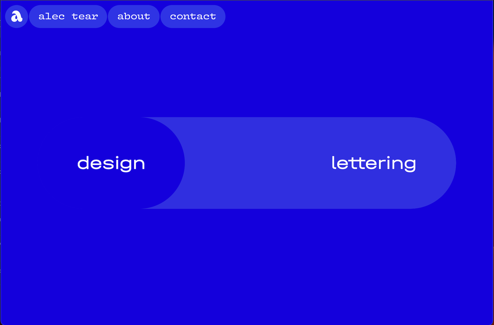
Instant load time, low-stakes interaction soothing for the brain, a beautiful blue field soothing for the eyes.
I had never heard of Alec Tear before. I had just navigated through a few hundred other portfolios. And yet here I was, with a simple click on a blue field, agreeing to learn just a bit more about this stranger’s work. Seems like something we all want to happen on our own websites?
Just enough content
On the ‘design’ portfolio page, we’re met with a hair more visual input. Miraculously, the restrained confidence — four single tiles — helps Alec’s bold colors and pop style slide seamlessly into our noodles without making our eyes and brains twitch.
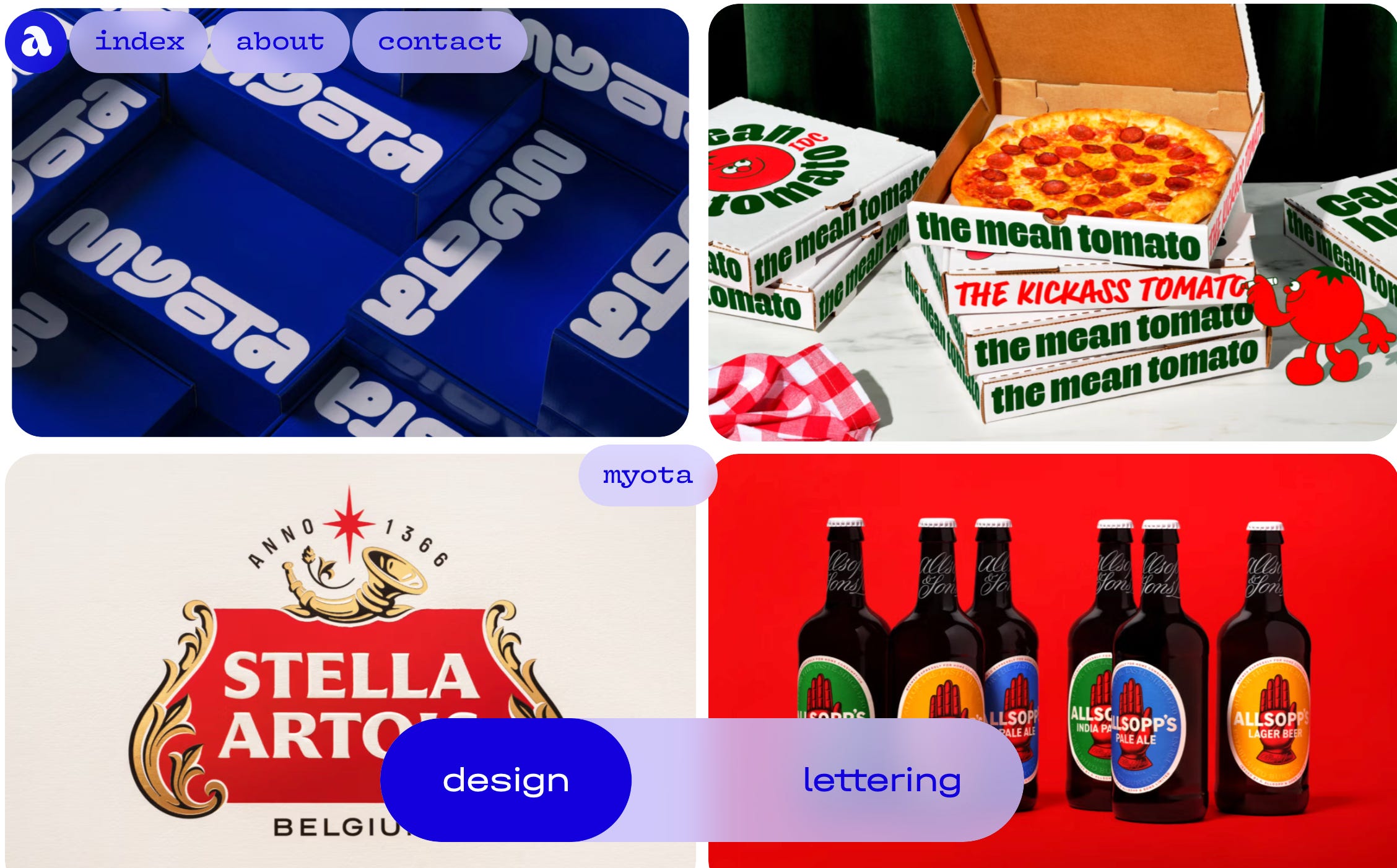
Harmony reigns. Hover-over tooltips display brand names without overstimulating the senses. Again a flicker of interaction. The now familiar ‘design — lettering’ toggle floats calmly at the bottom of the page, removing any fears we may have of having to gracelessly backpedal to the previous page to see Tear’s lettering work.
Just bold enough
Generous bubbles. Single-word menu items. Lowercase. Everything so abundantly clear in one easy swipe of the eyes. Just like that, Alec has instantly achieved the one goal of this portfolio page: for users to become fully present with the tastefully curated RGB-colored projects on the page.
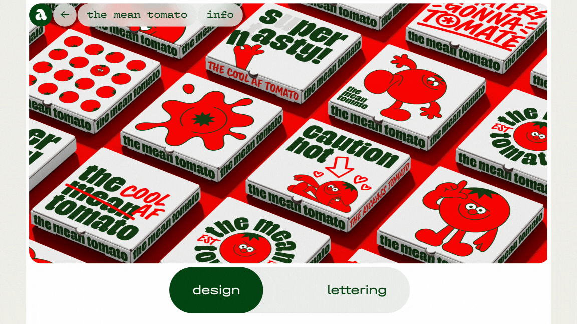
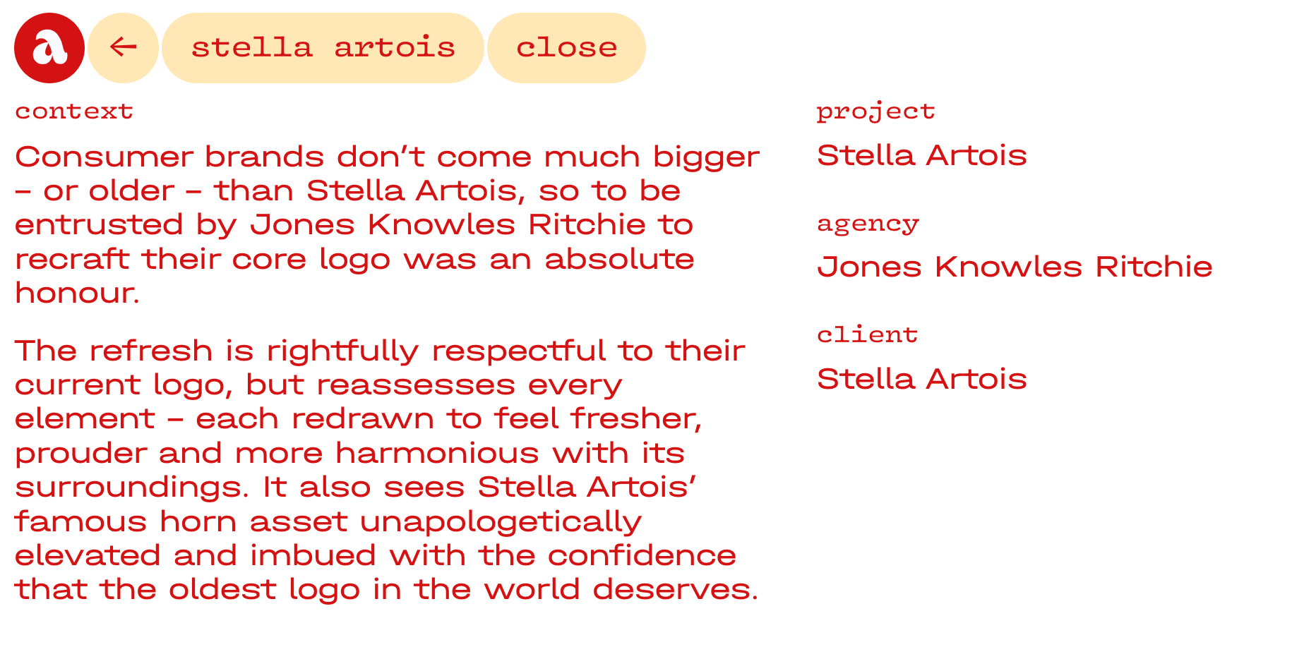
After a tiny scroll up and down through the portfolio projects I click on (what else?) The Mean Tomato. By now it’s not surprising to understand that the individual pages of Alex’s case studies are also characterized by confidence, control, and concept.
Case studies with confidence, control, and concept
The confidence in the case studies is quite literally unspoken. It simply appears in the lack of context we get when we first land on the page. Visual tiles line up without any descriptions. Perhaps we all should wonder why any words would ever obscure the first impression of your visuals.
Next, control. Want more info? Click ‘info.’ With yet another touching “choice” the curious are rewarded. Would you miss out if you hadn’t? Absolutely not. The visuals say it all.
Still, those who choose to want it get a kind of easter egg: Concept. Alec’s concisely narrated projects delight us with the key to his work and the success of his website: big ideas.
It seems concept, dear reader, is largely the only other thing on this website taking up space besides the work itself.
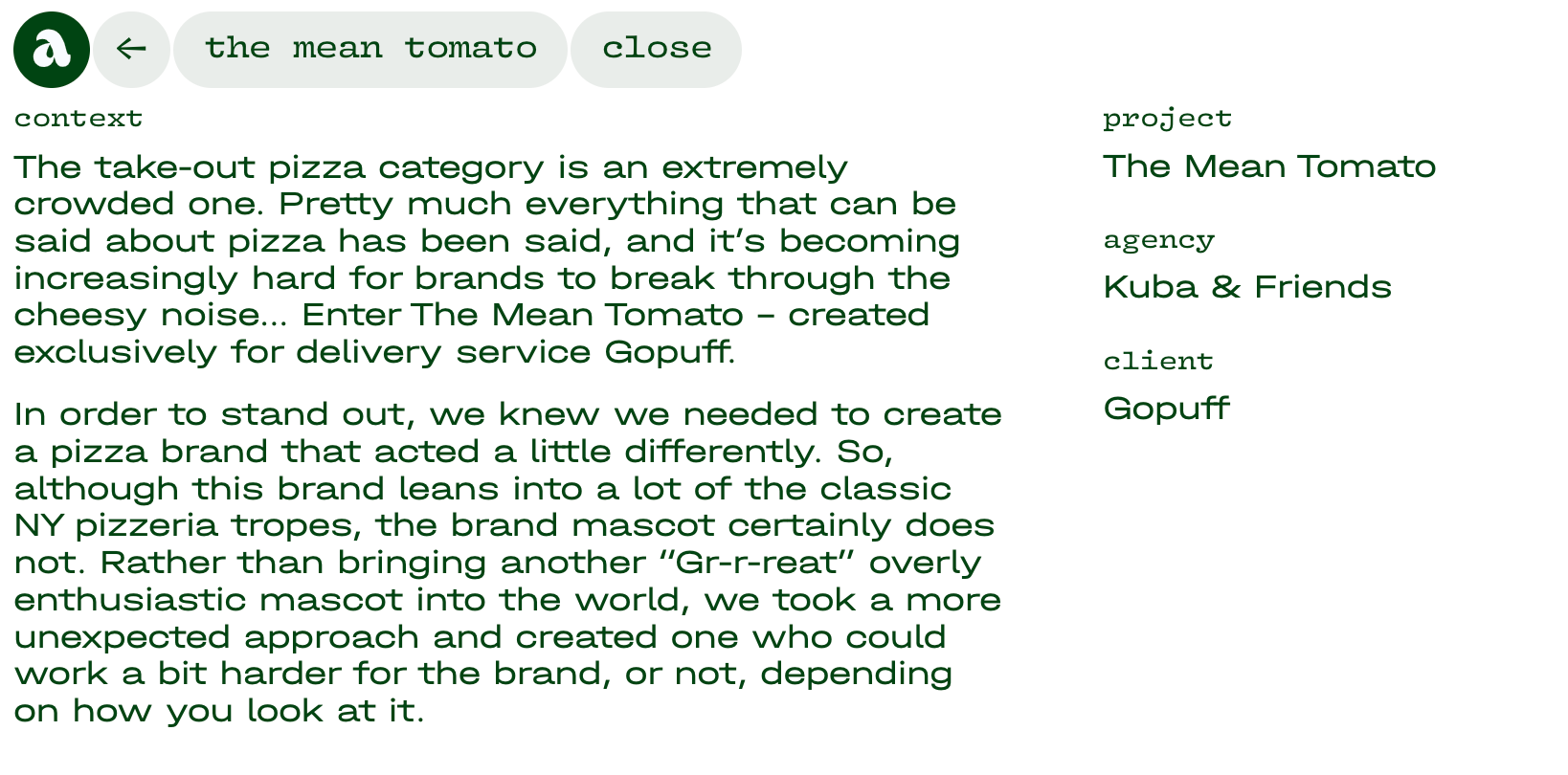
Alec doesn’t waste his breath with headlines. He does not over-embellish every detail of his work. Just like us throughout the entire website, he makes choices. He chooses one thing to elevate in each piece. He leads up to it quietly and leaves us with the satisfaction of getting ‘just enough’ information.
+1 for color
It took me a few visits to catch on to the subtle menu color transitions. How the menu points turn into the main color of each project. Even when they fly under the radar, little transitional details like this trigger peace and trust in our noggins. Any thoughtful signatures you can engineer into your website?
Simple is never easy. If you were inspired by the conceptual clarity of Alec’s website, here’s a small exercise to help you get into insights:
The ‘why’ ladder
Every project has a concept, even if you didn’t know it until after you created it :).
Here is a simple exercise to verbalize the big ideas behind your work.
Take a project from your portfolio and describe its style in a sentence. Use the why-how laddering to clearly define your concept:

Write down the brief or challenge that you started with
Step up the ladder from the problem or need, asking “why?”, considering options broader than the initial one.
Continue until you feel you have reached a root cause or common abstract need. This is the top of the ladder.
Climb back down the ladder, asking “how?”, considering options narrower than where you came from
Keep going until you’ve honed in on the unique solution for your brief
That’s all for today, thank you for stopping by!